This post guides you how to create attractive web shapes as per your desire and increase the attractiveness of the paragraph,table and image elements.Sometimes we may use many softwares to achieve this desired shape yet we cannot achieve what we desire but using CSS correctly it will open gates to create wide variety of shapes.So this tutorial will teach you to create different shapes using th border property of CSS.You may also implement it in your website/blog for simplified designs and quite enough to get attraction from your visitors.
HTML CODE:
This coding of this was very simple that is to define the class of the CSS code inside a <div>, <p>, <table> and <img> to apply the shape style to your desired elements.
<div class="Class_name">....</div>
CSS CODES:
This coding was the backbone of the shapes by adjusting the value of the border radius in means of percentage(%) or Pixels(px) you can achieve the shape you need.
ROUNDED CORNERS:
 .rounded{
  border-radius:20px 20px 20px 20px;
  -moz-border-radius:20px 20px 20px 20px;
  -webkit-border-radius:20px 20px 20px 20px;
  background:#1D86EF;
  height:200px;
  width:300px;}
ROUNDED CORNERS AT OPPOSITE SIDES:
 .rndop{
 border-radius:20px 0px 20px 0px;
 -moz-border-radius:20px 0px 20px 0px;
 -webkit-border-radius:20px 0px 20px 0px;
  background:#1D86EF;
  height:200px;
  width:300px;}
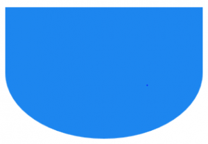
ROUNDED AT BOTTOM:
.bottm{
border-radius:0px 0px 20px 20px;
-moz-border-radius:0px 0px 20px 20px;
-webkit-border-radius:0px 0px 20px 20px;
 background:#1D86EF;
 height:200px;
 width:300px;}
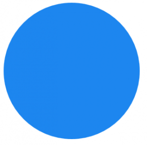
CIRCLE:
 .circle{
  border-radius:50% 50%;
  -moz-border-radius:50% 50%;
  -webkit-border-radius:50% 50%;
  background:#1D86EF;
  height:300px;
  width:300px;}
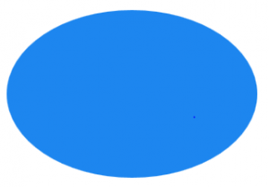
OVAL:
.oval{
border-radius:50% 50%;
-moz-border-radius:50% 50%;
-webkit-border-radius:50% 50%;
background:#1D86EF;
height:200px;
width:300px;}
The above shapes will save lots of time and also with little customization you can change it to another shape with less efforts.I hope this tutorial will be useful to you and multiple shape frames with different border color will be posted soon.

