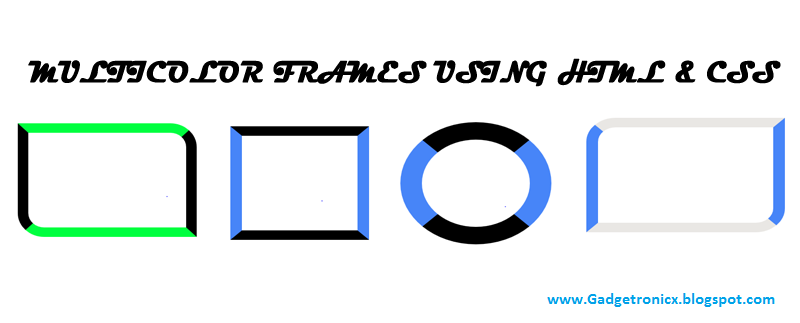
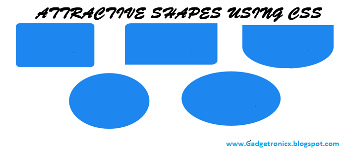
This is a interesting post which explains you how to create multiple colored frames using simple CSS and HTML codes.Previously i have explained about Creating attractive shapes using HTML and CSS and in this post you are about to see how to add colored frames for pictures using html and css.These codes can be applied to web elements such as table,paragraph and image.Now lets move on the codes to create this frame.
HTML CODE:
The HTML coding of this was very simple all you have to do is place your desired element in the <div> tag defining the class name along with it.
<div class="class name">.....</div>
CSS CODES:
This CSS code was the backbone of the multiple colored frames and it was done by means of changing the border-radius and border-color of the elements.
ROUNDED FRAME:
.frame1{
border-color:#000000 #4785F8;
border-image:none;
border-radius: 50% 50% 50% 50%;
-moz-border-radius: 50% 50% 50% 50%;
-webkit-border-radius: 50% 50% 50% 50%;
border-style:solid;
border-width:40px;
height:200px;
width:200px;}
SQUARE FRAME:
.frame2{
border-color:#000000 #4785F8;
border-image:none;
border-radius: 0 0 0 0;
-moz-border-radius:0 0 0 0;
-webkit-border-radius:0 0 0 0;
border-style:solid;
border-width:20px;
height:200px;
width:200px;
}
ROUNDED BORDER FRAME:
.frame3{
border-color:#E9E7E4 #4785F8;
border-image:none;
border-radius: 50px 0 50px 0;
-moz-border-radius:50px 0 50px 0;
-webkit-border-radius:50px 0 50px 0;
border-style:solid;
border-width:20px;
height:200px;
width:300px;
}
ROUNDED BORDER FRAME:
.frame4{
border-color:#00FF40 #000000;
border-image:none;
border-radius: 0px 50px 0px 50px;
-moz-border-radius:0px 50px 0px 50px;
-webkit-border-radius:0px 50px 0px 50px;
border-style:solid;
border-width:20px;
height:200px;
width:300px;
}

